The Food Mountain Phenomenon: A Playful Look at Overindulgence, Choice, and Visual Chaos
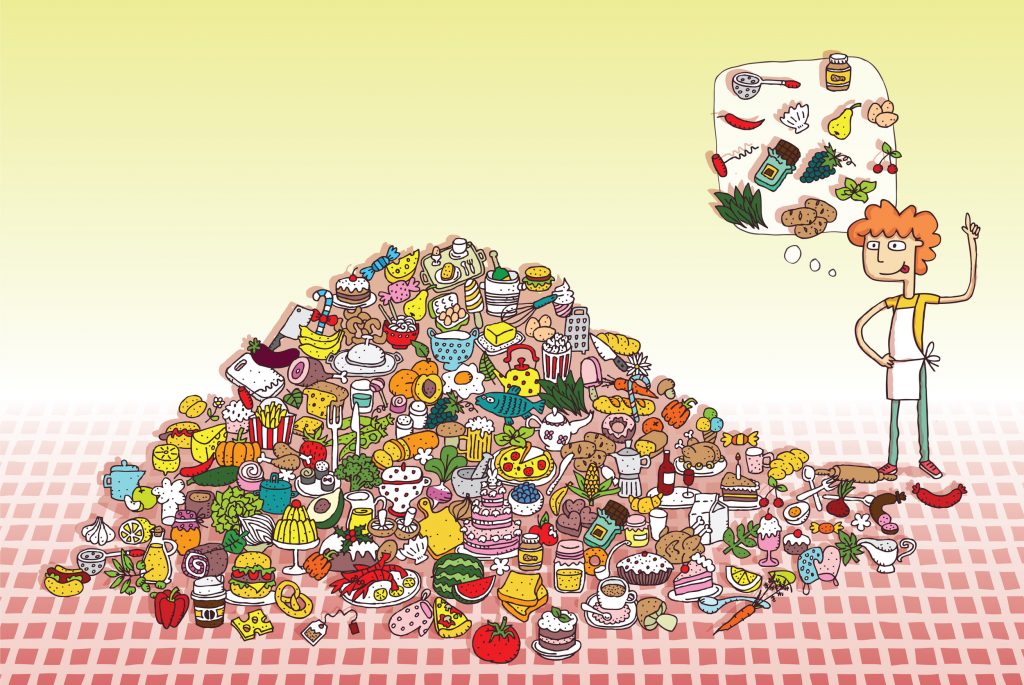
At first glance, this illustration looks funny, colorful, and harmless. A massive pile of food rises like a mountain. Cakes lean against burgers. Fruits mingle with fast food. Sauces drip, cups tilt, and snacks seem to multiply on their own. Off to the side, a character points upward, as if struck by a sudden realization.
But look closer.
This image isn’t just about food. It’s about decisions, habits, temptation, and the modern relationship we have with abundance. Wrapped in playful art and humor, it delivers a message that feels light yet surprisingly deep.
A Mountain Made of Cravings
This pile of food isn’t random. It’s carefully chaotic. Every layer represents a craving. Sweet treats stack beside salty snacks. Fresh produce struggles to stand out among pastries and processed bites.
It feels familiar, doesn’t it?
This “food mountain” mirrors the way many of us approach eating today. Options everywhere. Portions growing. Choices overlapping. The result isn’t satisfaction—it’s overload.
Like a table that never gets cleared, the pile keeps growing.
Visual Overload as a Storytelling Tool
What makes this image powerful is how busy it feels. Your eyes jump from item to item. A slice of cake pulls you in. Then a burger. Then fruit. Then something else entirely.
That visual overload is intentional.
It mimics how our brains feel when surrounded by endless food options. Menus with too many pages. Delivery apps with infinite scrolling. Grocery aisles packed with choices.
The clutter isn’t accidental. It’s the message.

The Character Who Finally Notices
On the right side of the image stands a figure pointing upward, a thought bubble floating above their head. Inside that bubble? Simpler food. Fewer items. More balance.
This character is the turning point.
They represent awareness. That moment when you pause mid-snack and think, “Maybe this is too much.” It’s not guilt. It’s clarity.
The contrast between the chaotic pile and the clean thought bubble speaks volumes—without saying a word.
Humor Makes the Message Easier to Swallow
If this image were serious, it might feel preachy. But it isn’t. The playful art style, exaggerated food pile, and cartoon expressions keep everything light.
Humor lowers defenses.
Instead of feeling judged, the viewer smiles. And while smiling, they reflect. That’s smart visual communication. It invites thought without pressure.
Like adding a spoonful of sugar to help the message go down.

A Modern Metaphor for Excess
This illustration doesn’t just talk about food. It hints at something bigger.
We live in an age of excess. More content. More notifications. More stuff. The food mountain becomes a metaphor for everything we consume—physically and mentally.
Too much input. Too little digestion.
The image quietly asks a question: at what point does abundance stop serving us?
Why the Illustration Keeps You Looking
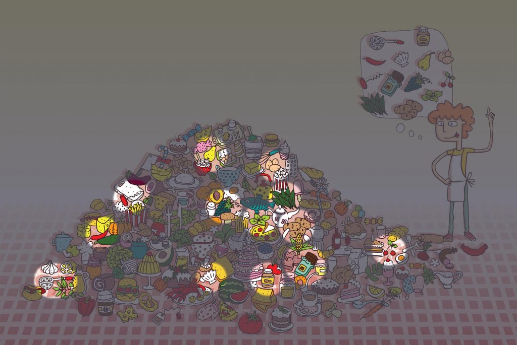
You can’t take this image in all at once. There’s always another detail. A hidden pastry. A tucked-away vegetable. A cup about to tip.
That’s intentional.
The longer you look, the more you notice. Just like habits. Just like patterns in daily life. Awareness doesn’t come instantly. It builds, layer by layer.
This image rewards patience, curiosity, and attention.

Color as Emotional Language
The colors matter. Warm yellows, reds, and pinks dominate the pile. These are appetite colors. They stimulate desire. They feel indulgent.
Meanwhile, the background stays calm and light.
That contrast amplifies the chaos of the food pile. It visually separates excess from clarity. Noise from calm. Impulse from intention.
Your brain picks up on it even if you don’t consciously notice.
A Subtle Nod to Mindful Choices
The thought bubble doesn’t reject food. It simplifies it.
That’s an important distinction.
This image isn’t anti-food or anti-pleasure. It doesn’t say “stop enjoying.” It says “choose with awareness.” It’s about intention, not restriction.
A powerful message delivered without a single word.

Why This Image Works So Well Online
Illustrations like this thrive online because they invite interaction. People zoom in. They point things out. They laugh. They share.
It sparks comments like:
- “This looks like my fridge.”
- “Why is this so accurate?”
- “I feel personally attacked.”
That relatability makes it memorable—and highly shareable.
A Gentle Mirror Held Up to Modern Life
In the end, this illustration feels like a mirror. Not a harsh one. A playful one. It reflects habits we recognize without shaming us for them.
It reminds us that awareness often begins with noticing. Noticing the pile. Noticing the pattern. Noticing the moment when “more” stops being better.
Conclusion: A Colorful Reminder to Pause and Choose
This food mountain illustration is more than visual fun. It’s a clever, humorous reflection on abundance, temptation, and conscious choice. Through chaos, contrast, and character, it tells a story that feels modern, relatable, and quietly insightful.
It doesn’t demand change. It invites reflection.
And sometimes, that’s exactly what we need—a playful nudge reminding us that clarity often begins when we step back, look again, and decide what truly belongs on our plate.
